
With many options for traders to figure out how to follow trends on forex currency pairs as well as commodities and other instruments, the most trusted form would be to follow the charts. Traders that use charts are labelled as technical traders, who prefer to follow the accuracy of charting tools and indicators to identify peaking trends and price points as to when enter and exit the markets.
While, there are the fundamental traders who prefer to follow news sources that offer actual information on economic growth, employment situations, political threats and interest rates.
BullsEye Markets will guide you in reading price charts and predicting their accuracy while trading Forex and CFD online. To help you launch your trading career we will outline a few tips to assist you in understanding and reading charts.
Firstly, one needs to know what a chart is before attempting to dissect the information presented. In summary, a chart is a depiction of exchange rates that happen between financial instruments that are plotted and illustrated on a graph. The ability to read charts is part and parcel of trading, as it allows you not only to keep track of your current trades but helps to detect a developing trend line for your future trades.
Understanding trends
When you look at a chart and find a grouping of data plotted in a general direction, one can figure out an overall direction that an instrument is moving towards. Every chart and graph differs, on most charts trend can be determined quiet easily, while other chart trends can be more complex. Trends generally move in a series of peaks and valleys (highs and lows). When you refer to a Bullish trend you are looking at a succession of mounting highs and lows and a Bearish trend is a sequence of descending lows and highs.
There is another trend that is known as the sideways, flat or horizontal trend. This is depicted when the forces of supply and demand are equal, so there is more of a straight line then a view of valleys and peaks.
Trends are not only classified by their direction, but also by the time duration as the trend is taking place. There are long-term, short-term and intermediate trends that coexist and may have the same, as well as the opposite directions. They are pretty self-explanatory as they are time based and are part of the trendline you see when reading a chart.
Types of trading charts
Clarity and a full understanding of what a chart is showing as well as the information that it provides is imperative to trading. When you board on online trading there are three main chart types that are popular among trading circles. Each chart has their level of information according to the traders’ individual skill level:
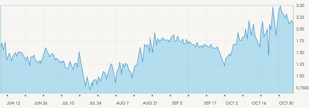
Line Chart– The most basic of charts, and the stepping stone for the beginner trader. This chart represents only a closing price over a period of time, the closing price is often considered the most important element in analysing data. This is in essence, how the line chart is formed: by connecting the closing prices over a set time frame. There is no visual information or trading range, meaning no highs and lows and nothing on opening prices.
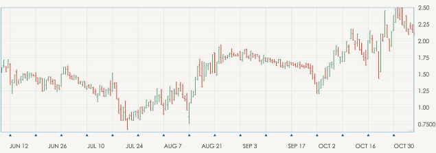
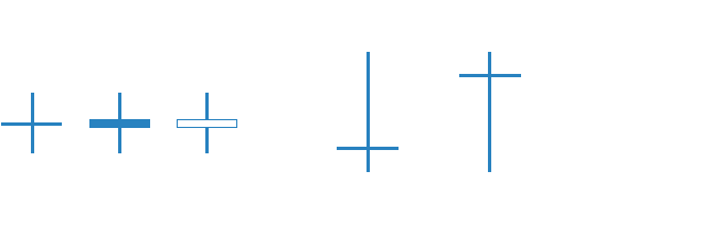
Bar Chart – Expanding in more detail on the line chart, the bar chart includes several more key fragments of information that are added to each data point on the graph. Made up of a sequence of vertical lines where each line is a representation of trading information. They do represent the highs and lows of the trading period as well as the opening and closing price. The open and the close price are represented by a horizontal shorter line.
The open price is the ‘dash’ that is located on the left side of the vertical bar and conversely the close price indicated by a similar horizontal line, however, to the right side of the bar. Understanding this chart is simple, if the left dash (which is open price) is lower than the right dash (closing price) then the bar will be shaded in green, black or blue and represents a price increase and the instrument gained in value. The opposite is true and the decreased value of the stock is indicated in red.
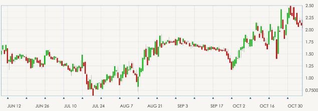
Candlestick Chart – Once you have mastered the line and bar charts, you can graduate to the candlestick chart which will be easier to understand as it is similar to the bar chart. The vertical lines of both charts illustrate the trading period’s price ranges, while the body of the candle uses different colours to represent the market changes of that time period.
Candlestick charts detail
Dating as far back as the 17th century, the Japanese began using the technical analysis to trade on rice, although quiet different to the US version created around the 1900s their principles are similar.
In order to start creating and reading a candlestick chart, one should know that the data contains highs, lows, open andclose prices.
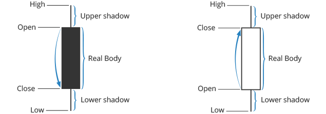
The ‘hollow’ and the ‘coloured’ portions are called the body. The long thin lines above and below the ‘body’ represent the high or low ranges and are also referred to as either shadows, wicks or tails. Should the lines be placed at the top of the body this will tell you the high and close price, while the line at the bottom of the graph indicates the low and the low’s close price.
The colours of the candle body do vary from broker to broker, where they could either be green or blue, illustrating a price increase or red being a decrease in price, or hollow candlesticks is where the close price is higher than the open price which will indicate to traders to BUY. Filled / coloured candlesticks where the close price is less than the open will indicate a SELL position.
Long versus short bodies will indicate the buy or sell pressure among traders. Short bodies represent there was very little price movement and are often treated as a consolidation pattern, known as doji.
Doji is an important facet of the candlestick graphs as they provide information in a number of patterns. These form when the instruments open and close prices are virtually equal and there’s not much price difference. The relevance of a doji candles are to show traders that either: After a long white or green candlestick the buying pressure is starting to weaken, or after a solid long (blue or black) candle that the selling pressure is starting to decrease and the supply and demand are starting to even out.
Graphical Analysis
One of the most popular and reliable patterns of graphical analysis is the head and shoulders pattern.
This pattern is a reversal pattern, that when is formed will be a sign that the current trend will see a reversal soon. There are two versions of the head and shoulders pattern:
1. Head and shoulders Top: Generally formed at the peak of an upward trend and signals that the asset’s price is set to fall once the pattern is completed.
2. Head and shoulders Bottom (or Reverse Head and Shoulders): Usually forming during a downward trend, the head and shoulders bottom pattern signals that the asset’s price is set to rise.
Both have similar visual construction as each contain four main elements: two shoulders, a head and a neckline. Patterns are formed when the neckline (support and resistance) is broken and a second shoulder is formed. Heads and shoulders are formed by peaks and valleys on a graph. There are many other formations that traders turn to for analysing trade setup such as: Double top/bottom, triple top/bottom, Pinocchio, bullish/bearish engulfment, etc.
Incorporating a technical analysis tools into your charts
As you grow more comfortable reading and examining the charts you will learn how to add other tools such as a technical analysis to measure the rate of market volatility and changes in value. These technical indicators can assist you in clarifying the exact market information that could be missed with some stocks or currencies that are commonly labelled as ‘oversold’ or ‘overbought’.
In essence, technical indicators incorporated into your live charts like volume indicators, moving averages, MACD, trend lines, Fibonacci levels, stochastic oscillators etc., can block out the market noise, forming a better picture of the markets and trends that lie ahead.
BullsEye Markets have written this in depth guide in order for you to understand how some of the core technical analysis tools are applied by professional traders. Learn how to implement what you have learnt by means of our free demo account, test the tools and charts provided by our technically advanced platforms.

 English
 French
 Thailand